Category: Data Management
-
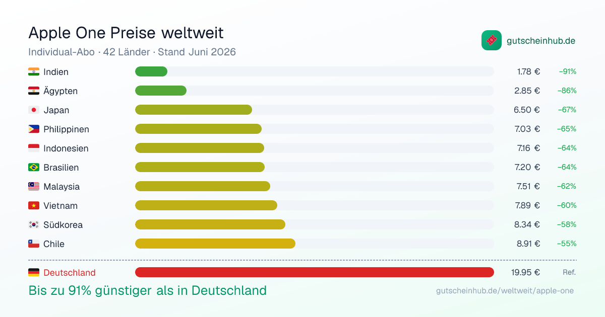
Apple One Costs Up to 91% Less in Other Countries: A Visual Comparison of 42 Markets
Apple One bundles Apple Music, TV+, Arcade, and iCloud into a single subscription. What most people don’t realize: the price varies dramatically depending on which country your Apple ID is registered in. I built an interactive comparison of all 42 countries where Apple One is currently available. The results are striking. The Highlights India: €1.78/month…
-
Sommermärchen ade: Was Sportdaten über Toni Kroos und den deutschen Fußball verraten – Neue Folge von „Die Digitalisierung und Wir“
Sommermärchen ade In der 120+6. Minute versuchte die Deutsche Nationalmannschaft sich ein letztes Mal gegen das bevorstehende Ausscheiden aus der Europameisterschaft zu stemmen. Toni Kroos brachte die Freistoßflanke in den Strafraum – der spanische Keeper Unai Simón hatte aber keine Probleme, den Ball zu behaupten. Kurz danach pfeift der Schiedsrichter ab – das Sommermärchen ist…
-
#datamustread: Visualize This: The FlowingData Guide to Design, Visualization, and Statistics (2nd Edition) by Nathan Yau
While my latest book, KI für Content Creation, has just been reviewed by the renowned c’t magazine, I’m happy to continue reviewing books myself. Today, I’m reviewing the just-released second edition of a cornerstone of the data visualization community, Visualize This: The FlowingData Guide to Design, Visualization, and Statistics by Nathan Yau. Visualize This: A…
-
Unlocking the Power of Data Science with Excel: Discover the Book “Data Smart”
Data Smart (Amazon) is an exceptional guide that creatively uses Microsoft Excel to teach data science, making complex concepts accessible to business professionals. This 2nd edition, masterfully updated by Jordan Goldmeier, arrives a decade after John Foreman’s highly acclaimed original version, bringing fresh perspectives and contemporary insights to the renowned first edition. Whether you’re a…
-
Power BI Tricks: 20 Essential DAX Tricks for Your Power BI Reports – A Comprehensive Guide to Power BI DAX
Power BI DAX (Data Analysis Expressions) is at the core of Microsoft’s Power BI and offers incredible capabilities for data manipulation and insights. In this post, we’ll explore 20 ultimate DAX tricks to elevate your Power BI reports. Whether you’re a beginner or an expert, these tips will help you unlock the full potential of…
